


Still Mink

Member
1,163 posts
2,853
Seen 15th August 2023


")
")


")


 CrimeSolvers
19th April 2020, 02:23 PM
Ideologically Opposed
I have recently redesigned both the flags of North Korea and South Korea, both in a way that looks similar but strikes an ideologically opposite feeling.
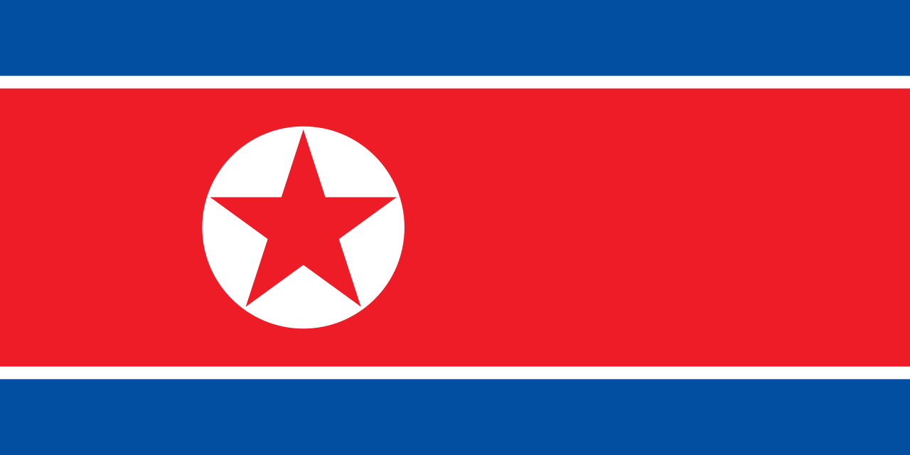
If you do not know what their flags look like, here are the ORIGINALS.
NORTH KOREA: Ramhongsaek Konghwagukgi
SOUTH KOREA: Taegukgi

THE REDESIGNS
NORTH KOREA:

SOUTH KOREA:

EXPLANATION
The North Korean redesign, utilizes a more simplified version of grain surrounding the Juche symbol that the Worker's Party of Korea uses. On top is a yellow star, representing the unity and nationalism of the country.
The South Korean redesign creates a ring around the Taeguk using the trigrams on the previous flag. I swapped out the red for black for a more aesthetic and balanced feel, and also made the blue lighter for a more democratic feel.
Tell me what you think below.


 Drake
Drake 


 Belmont